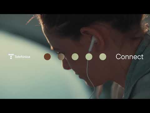
Telefónica unveils a new corporate image that projects its digital and technological transformation
-The new logo, composed of five circles, reclaims and evokes the logo created in 1984 to recognise the companys legacy, and adapts and simplifies it to project its future, with a clear commitment to technology and digital environments.
-This new identity reflects a new Telefónica ready for the next 100 years", says the companys Chairman, José María Álvarez-Pallete.
Telefónica presented this Friday, during the General Shareholders Meeting, a new corporate identity that reflects the New Telefónica resulting from the strategic plan presented in November 2019. This roadmap is now strengthened by a refreshed image that captures the companys leadership, potential and vision for the future.
The change of logo is a further step in the transformation process that the Group has been working on in recent times, with the aim of projecting a more modern, flexible and digital Telefónica. The previous logo had been in place since 1998 and the idea of creating a new image responds precisely to the desire to visually express Telefónicas transformation and leadership in recent times, as evidenced in such important areas as the massive deployment of fibre optics, the configuration of a more sustainable and diversified model, the implementation of the 5G network, the use and enhancement of telecommunications infrastructure and the proliferation of new technological solutions to promote fair and inclusive digitalisation within everyones reach. With the new logo, the companys identity now reflects the New Telefónica.
Distinctive, but recognisable
Projecting this future, the new identity is also heir to the legacy of an almost century-old company, as Telefónica has just turned 97 years old. It is therefore a distinctive but recognisable logo, as it recalls the logo created in 1984, which was also announced at the Shareholders Meeting held that year.
Now, this logo has been simplified and modernised to adapt it to the new times, with the aim of generating a brand expression that connects with todays society, with customers and with the different audiences the company addresses. An image that also fits in with Telefónicas mission, which remains steadfast in its aim to make the world more human by connecting peoples lives.
The logo, now in force in all the countries in which Telefónica operates, is made up of five circles which, as in the case of its predecessor, form the letter T, Telefónicas distinctive letter. In this case, more stylised, agile and modern, but at the same time honouring the companys history. Its use will be extended to areas that use the Telefónica brand such as Telefónica Tech, Telefónica Empresas or Fundación Telefónica.
Full of symbolism
The emblem is made up of five spheres because of the special symbolism this number has for the Group. Firstly, because it is the fifth logo in the companys history. Secondly, because five are the pillars on which the New Telefónicas action plan is based. And third, because each circle represents each of the Ts that constitute the companys hallmarks: telecommunications, technology, transformation, talent and transcendence.
[p"This new identity reflects where we come from, because we are the backbone of society through telecommunications. It reflects where we are going, as we are an increasingly technological company that wants to play a leading role in the world to come. It reflects the companys DNA, which is one of innovation and continuous transformation. It reflects the soul of the company, which is the talent of the professionals who drive the present and future of the company. And it reflects the transcendence of everything we do, of our purpose", said Telefónicas Chairman, José María Álvarez-Pallete, in reference to each of the five T. "In short, this new identity reflects a new Telefónica, ready for the next 100 years and will be the lighthouse that guides us on this course we have already embarked on", concludes the Chairman.[/p]The new image thus reflects Telefónicas commitment to technology and digital environments. This is the reason why a blue colour has been chosen, which exudes modernity and technology, and why a new typography, Telefónica Sans, has been created, fully designed and optimised for digital environments.
The new corporate identity has been developed by the companys branding team with the support of Lambie Nairn, the exclusive Telefónica account management division of Superunion, WPPs branding consultancy, which has been working with Telefónica for more than 10 years and has been involved in updating the identity of our O2, Movistar and Vivo brands in recent times. Their in-depth knowledge of the company and the brands in the different geographies and businesses has been key to reflecting the New Telefónica identity.
About Telefónica
Telefónica is one of the worlds leading telecommunications service providers. The company offers fixed and mobile connectivity services, as well as a wide range of digital services for individuals and businesses. It is present in Europe and Latin America, where it has more than 345 million customers.
Telefónica is a fully private company whose shares are listed on the Continuous Market of the Spanish stock exchanges and on the New York and Lima stock exchanges.
-----
https://www.youtube.com/watch?v=M0F-6KygKYI
( Press Release Image: https://photos.webwire.com/prmedia/6/273042/273042-1.jpg )
WebWireID273042
This news content was configured by WebWire editorial staff. Linking is permitted.
News Release Distribution and Press Release Distribution Services Provided by WebWire.

