COSMO Revamps Its Corporate Image and Logo
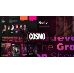
COSMO is celebrating 24 years on the air with a completely revamped corporate image. This restyling modernizes and simplifies the recognized brand identity, updating the design while respecting its original essence. Changes have been implemented this week and are already visible for the audience.
COSMOs logo has undergone a significant change, embracing a chromatic version that maximizes its visibility on dark backgrounds, which are predominantly found in the interfaces of on-demand television services. The new logo has transmuted to a crisp white in its typographic form for greater visual harmony with the broadcasted logo, while keeping the corporate pink pantone intact, which remains on its outline or encasing.
This outline is embellished with a new gradient shade in an orange tone, which adds an extra touch of brightness and vitality, thus reinforcing the brands distinctive visual identity. Its characteristic encapsulated form gains prominence in the channels promos and videos, coming alive and moving during transitions. As a result, the COSMO logo pulsates to announce, through flashes, a change on screen: information input, a color change or the appearance of an image or content.
The redesign of COSMOs corporate image is also reflected in a much simpler color palette that facilitates both the reading of the images and the identification of the brand. In addition, COSMO has created a series of musical pieces with a clarity and sonority that echo the same universe. The result is a vibrant, fresh and elegant image whose black background invites the viewer to travel to a world full of stories, fiction and entertainment.
This new COSMO image update can be seen in all the channels components. The new graphic applications will also adorn the continuity of the channel and other corporate environments, such as the website and the different social media accounts.
This complete redesign reinforces the COSMO brand, achieving an image that is more COSMO than ever. Both conceptually and graphically, we have distilled the essence of the brand, updating the most characteristic elements of the channel while preserving our identity. The colors, the lines, the animations, the music, everything evokes a dynamic, modern and inspiring COSMO universe. We are very satisfied and excited about the change, says Alberto Lafuente de Pablo, the channels Director of Communications, Marketing and On-Air.
The launch of this new image is accompanied by new features in COSMOs programming, which continues to include renowned international series, the best films and entertaining programs. Among the channels upcoming premieres are the three seasons of Professor T, an acclaimed British series that for the first time will be available in its entirety in Spain; Mademoiselle Holmes, a stunning crime series about the heiress of the famous detective; The Special Finale of Tandem, the long-awaited conclusion of the famous French series after seven seasons; and the new seasons of hits such as Beyond Paradise and McDonald & Dodds.
COSMO is a leading pay TV channel available on all major Spanish platforms. The channel is part of the A+E Networks EMEA portfolio, a leading media group that delivers programming to more than 76 million households in 100 countries.
( Press Release Image: https://photos.webwire.com/prmedia/7/320879/320879-1.jpg )
WebWireID320879
This news content was configured by WebWire editorial staff. Linking is permitted.
News Release Distribution and Press Release Distribution Services Provided by WebWire.
